.
ROLE:
Mobile Interaction Designer
.
.
TEAM:
Google Scholar
Google SIM UX
.
Google Scholar
.
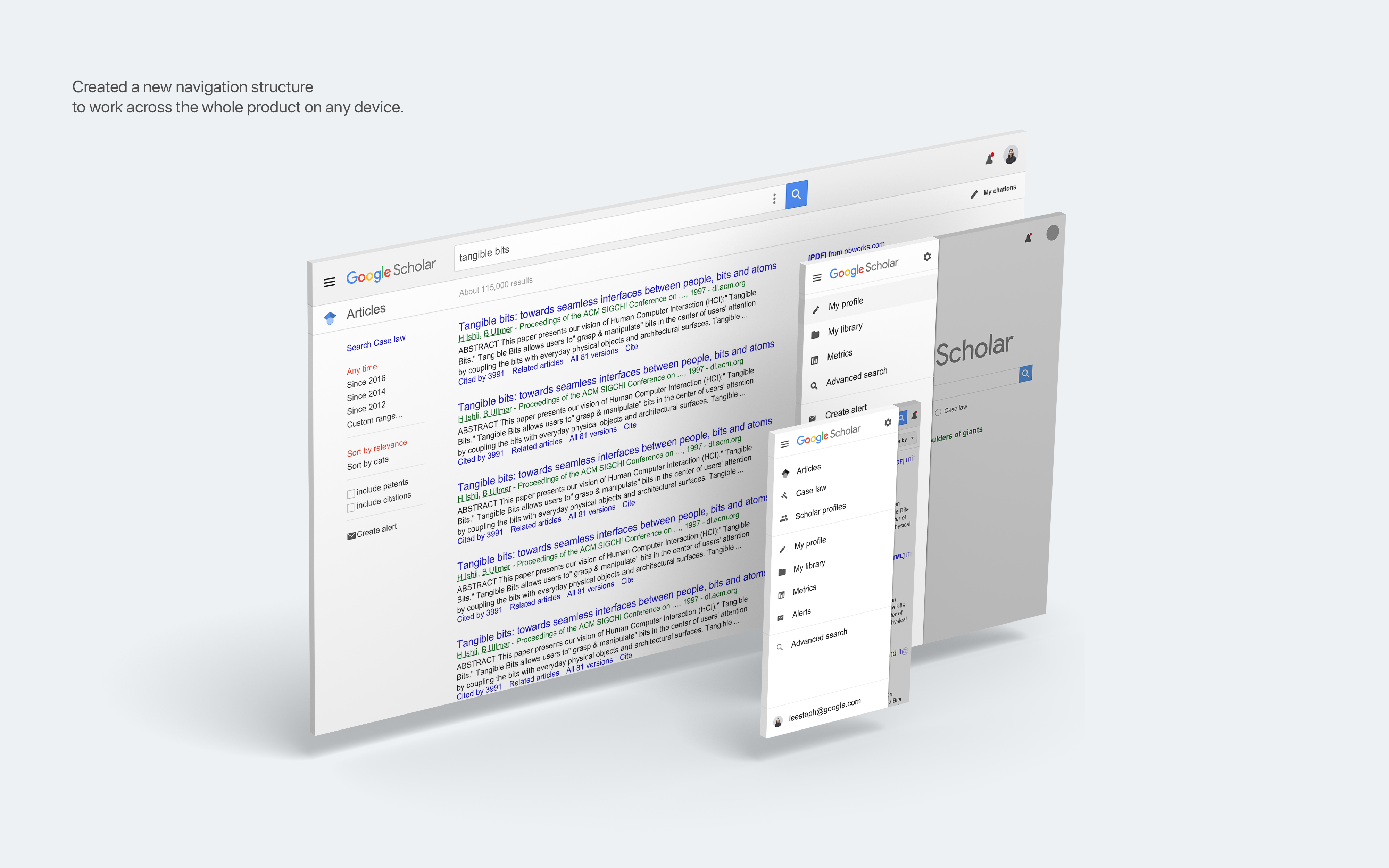
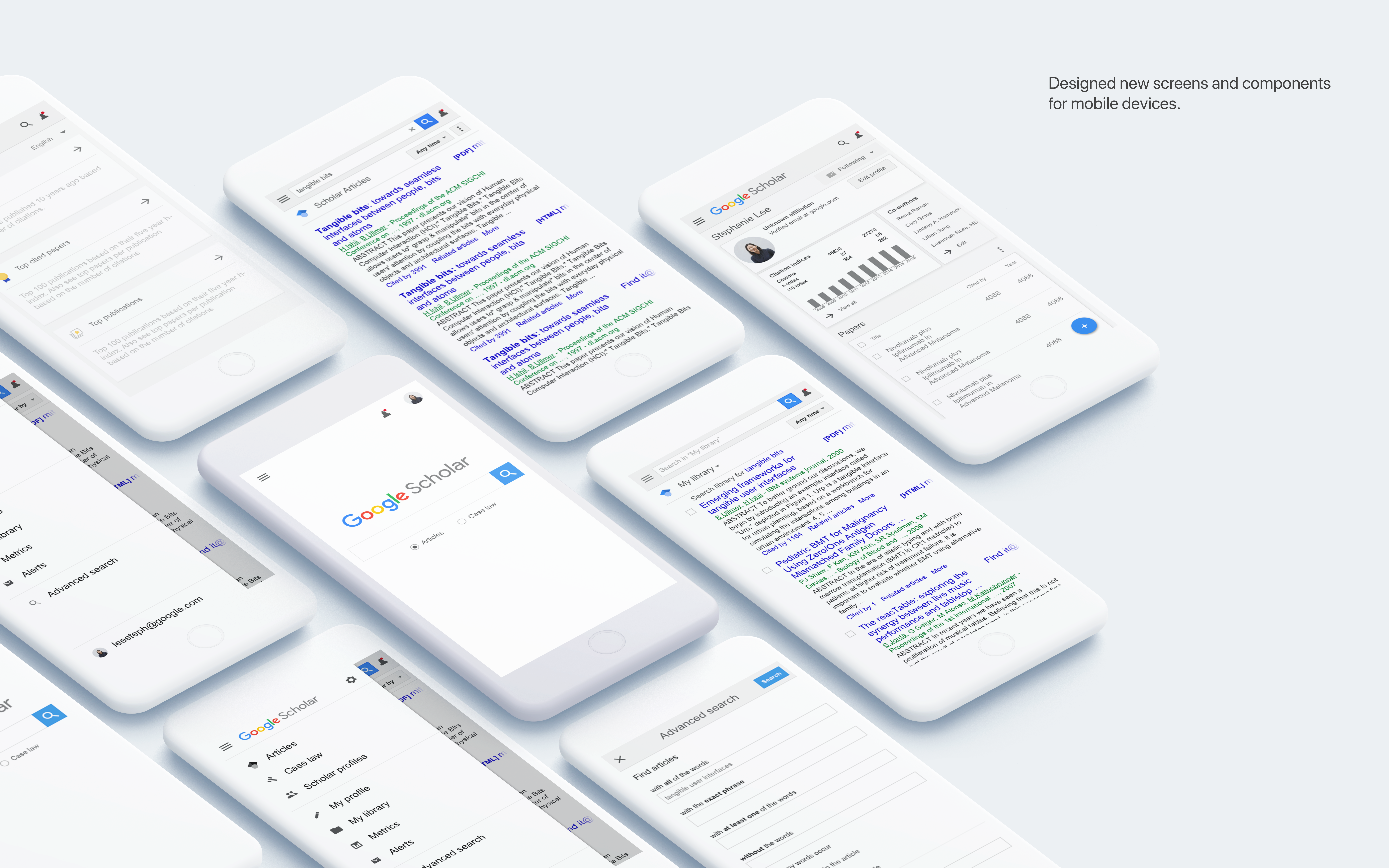
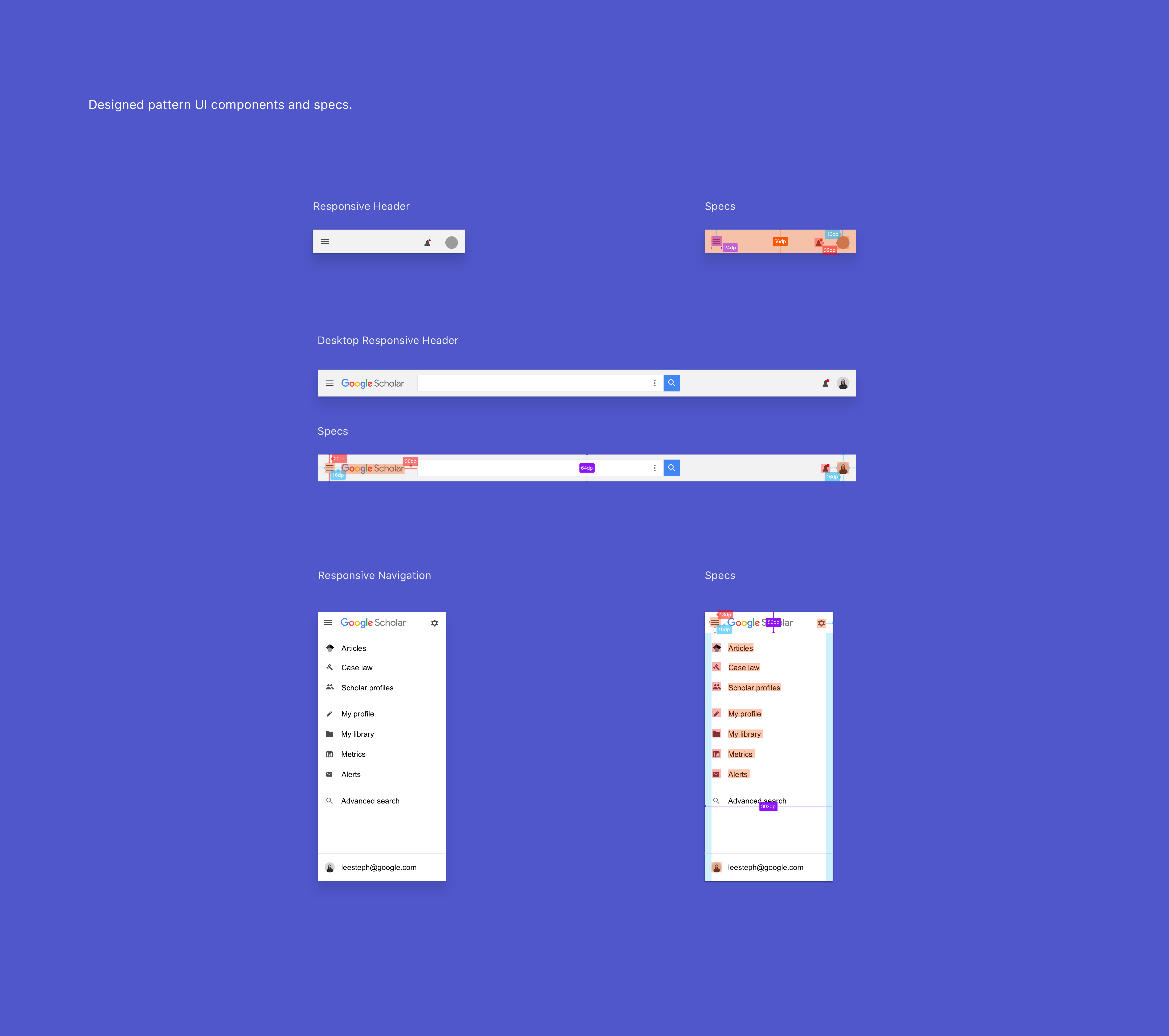
Google Scholar is the leading platform for researchers and academia internationally. I was brought onto the team to lead their product design efforts in becoming more mobile friendly, responsive, and up to date with Google's current design standards in order to make way for new features. I initiated and designed Scholar's new navigation, realizing early on that the existing design led to poor user experiences on non desktop devices. I designed new navigational components—new headers, new menus, and a new set of guidelines for when certain navigational components should be used. After setting the foundation, I lead the design of Scholar's newest product — Scholar Metrics, ranking and visualizing top papers, authors, and publications.

.
Scholar Metrics
.
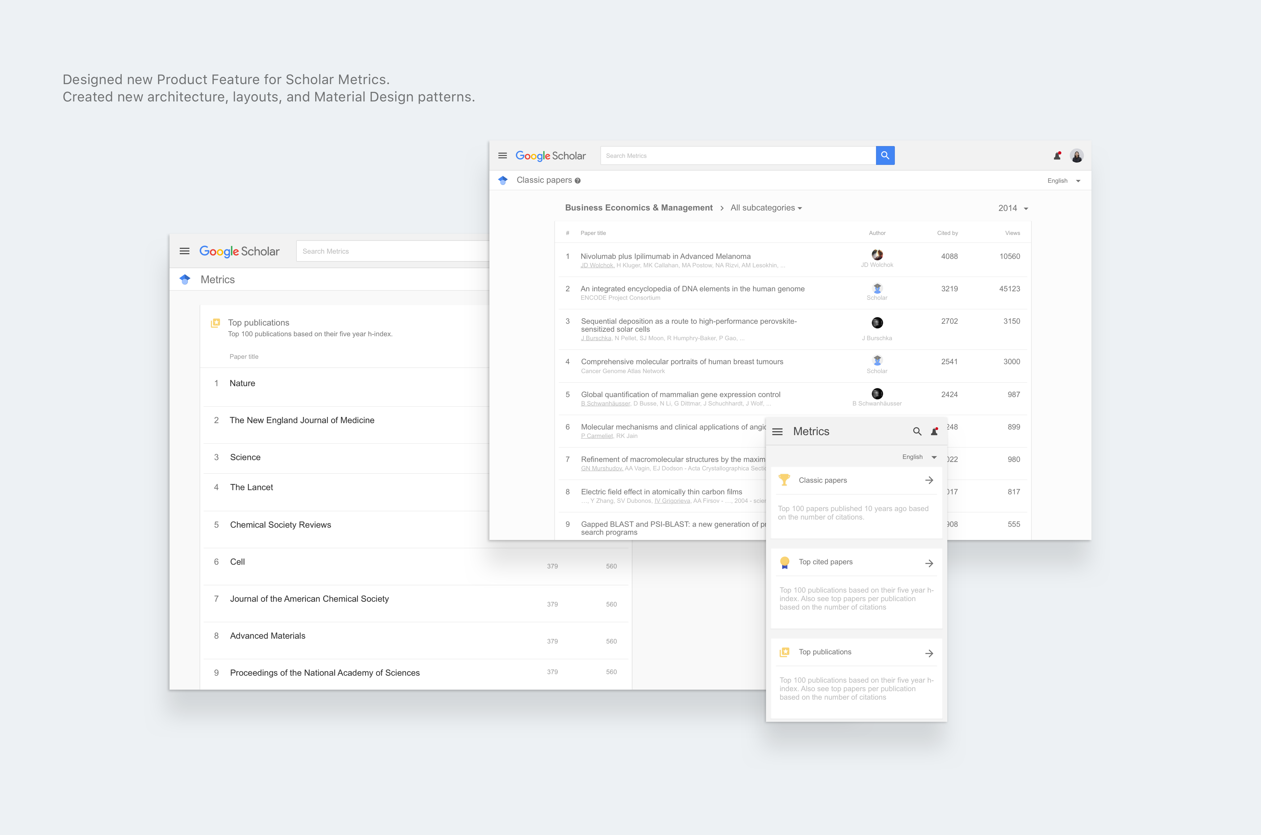
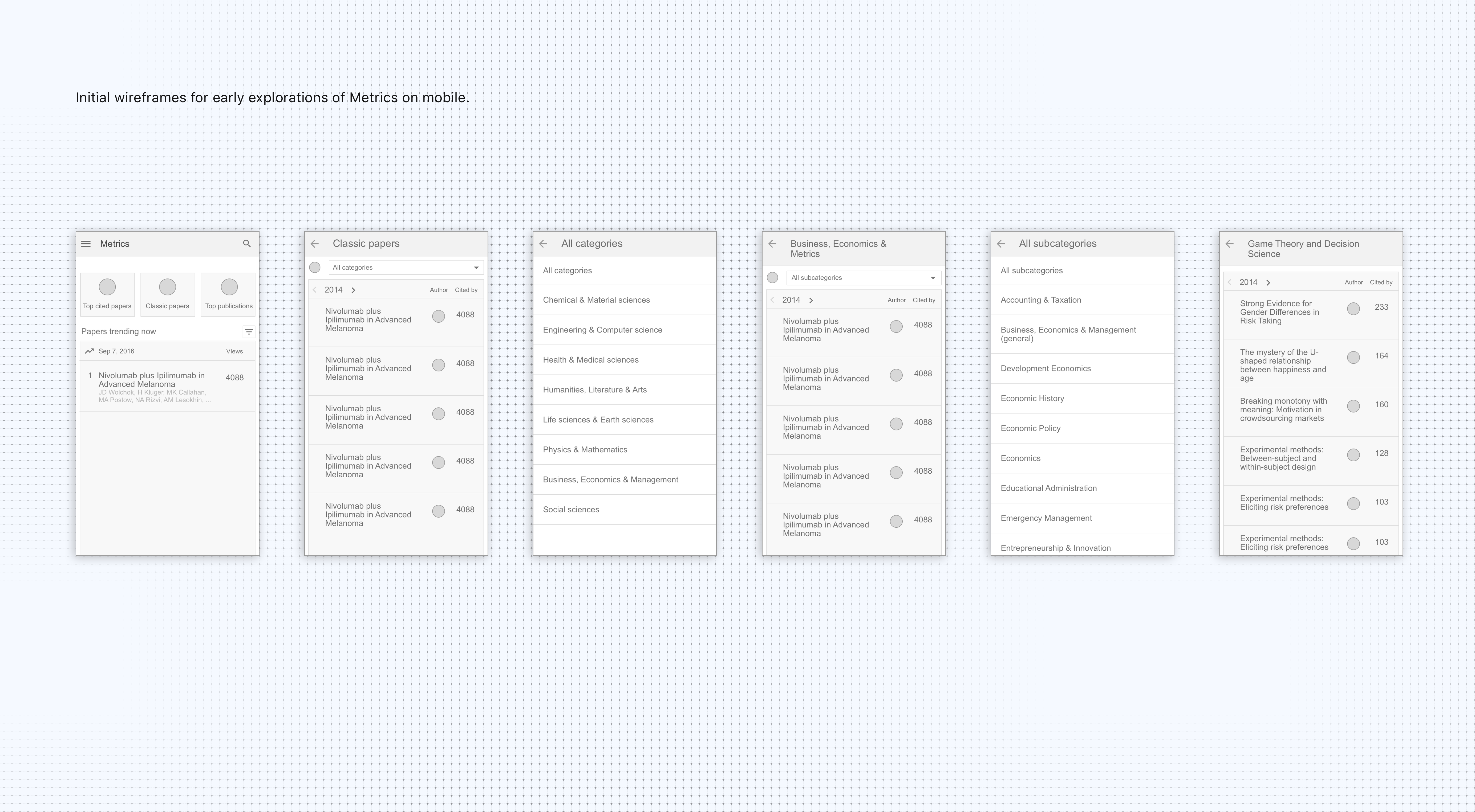
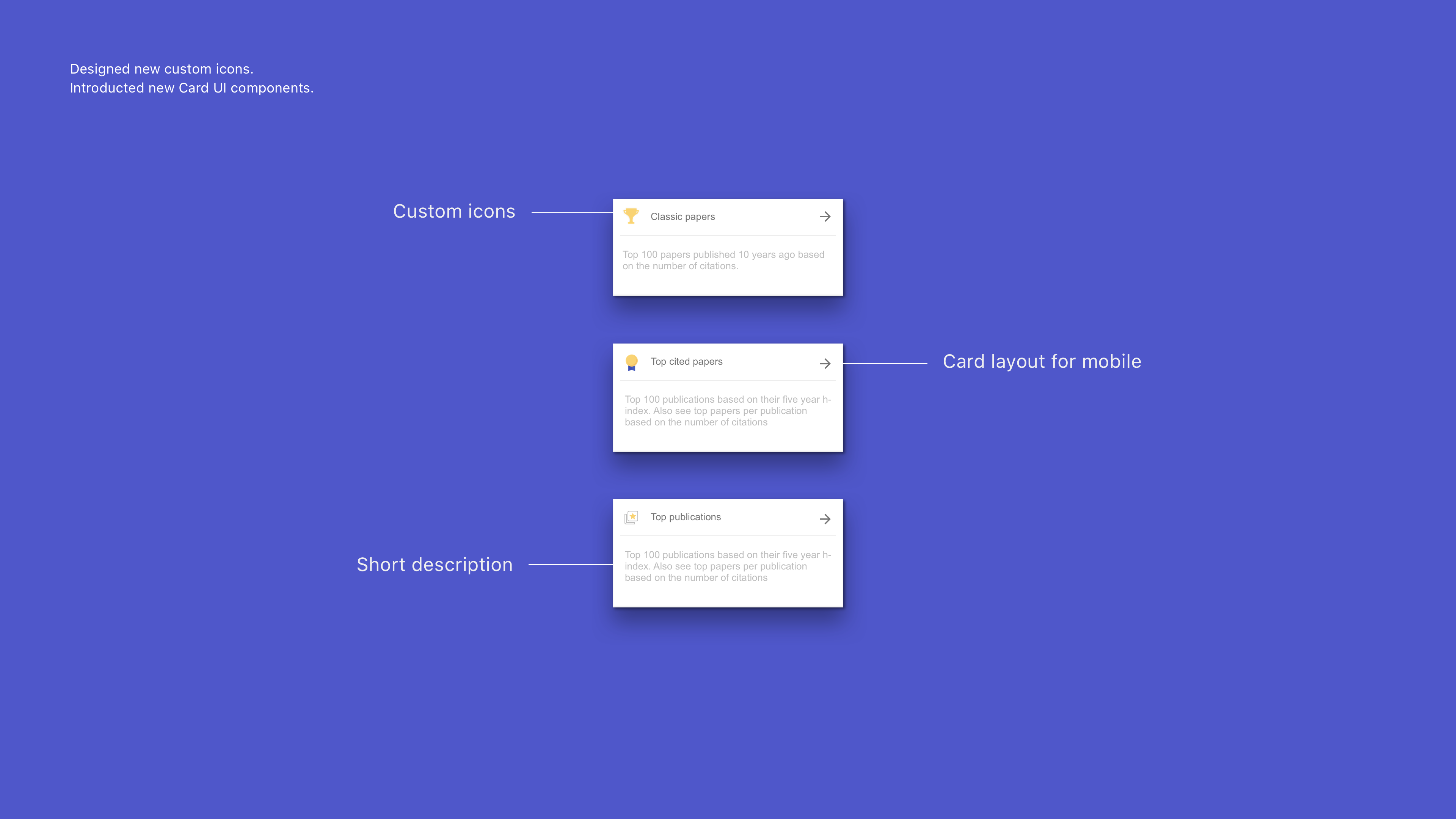
I designed Scholar Metrics, a new feature for Scholar. Many in academia use Scholar rankings based on their published papers and citations to apply for jobs, grants, scholarships, visas, etc.— A key feature of what has made Scholar such a widely used product. Scholar Metrics highlights rankings by displaying the top papers by categories as well as the top cited Publications.
.
Scholar Mobile
.
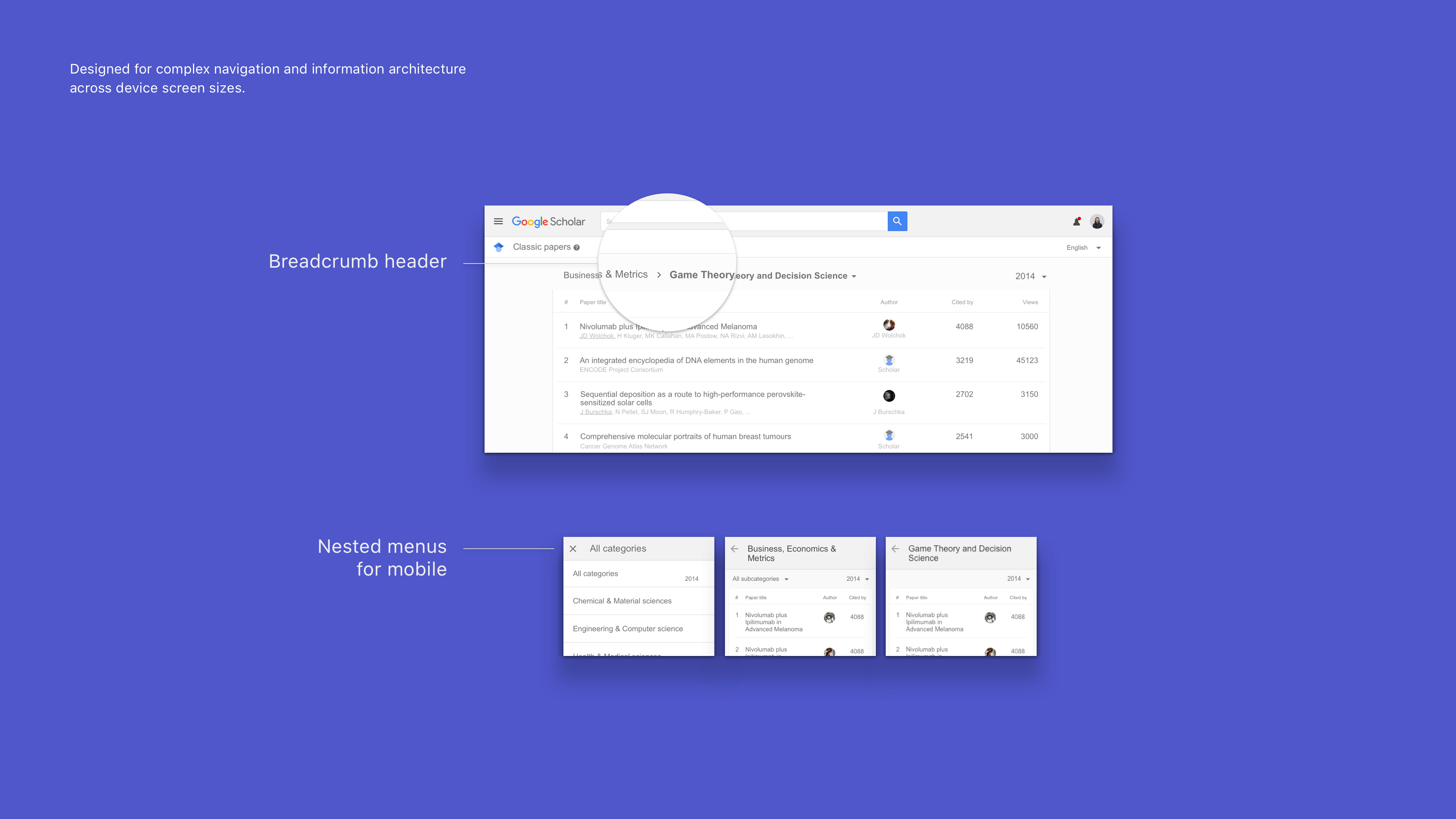
I lead the initiative to restructure the navigational architecture of the product which previously relied on desktop screen sizes. Adding any new features such as Scholar Metrics would have been difficult without first overhauling the old information architecture and introucing a fresh navigation structure following guidelines for Google Material Design.
A complex interface with many substructures and hidden features, changing the navigation to support the many different requirements required many iterations and new components.
